SqueezeIt - Brand Website
A fully responsive three-page promotional website for SqueezeIt, a fictional fruit-flavored drink brand, built as the Summer Final Integrated Project.

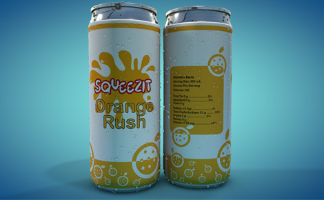
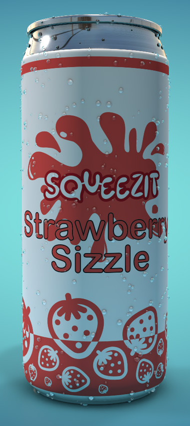
A Summer FIP project for the Interactive Media Design program. SqueezeIt is a three-page responsive website - Homepage, Products, and Contact - built to follow the SqueezeIt Brand Guide V2.0 faithfully.
Translating a detailed brand guide into a fully responsive website that keeps the brand's playful, colourful character intact across desktop, tablet, and mobile breakpoints without compromising layout or consistency.
Built a mobile-first, three-page site using HTML, CSS, and JavaScript. Used srcset and picture elements for responsive images, a hamburger menu for mobile navigation, and kept typography and colour faithful to the brand guide throughout.